





Designing Expedia’s next-gen ad platform
A scalable self-service platform for global advertisers.
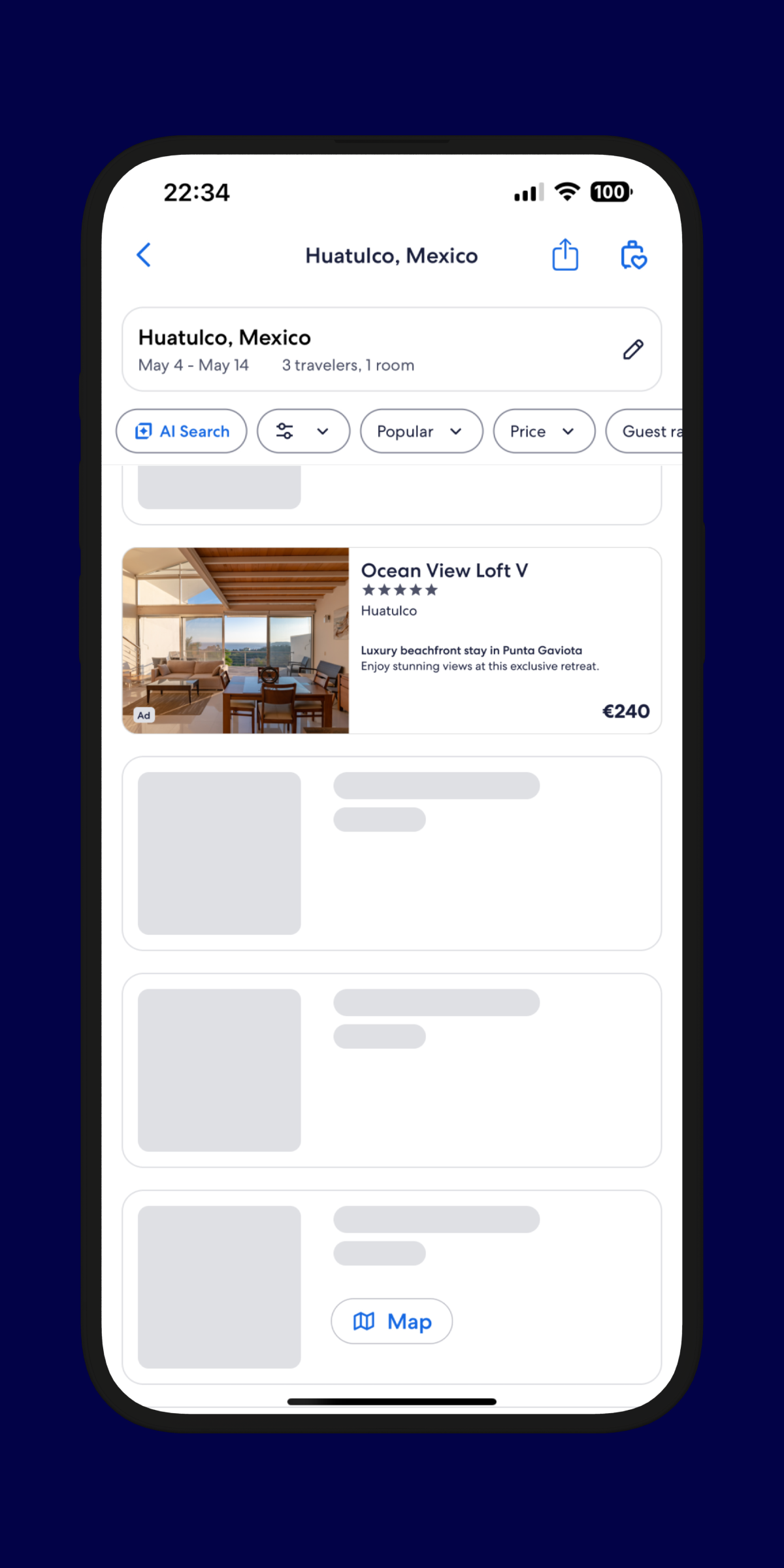
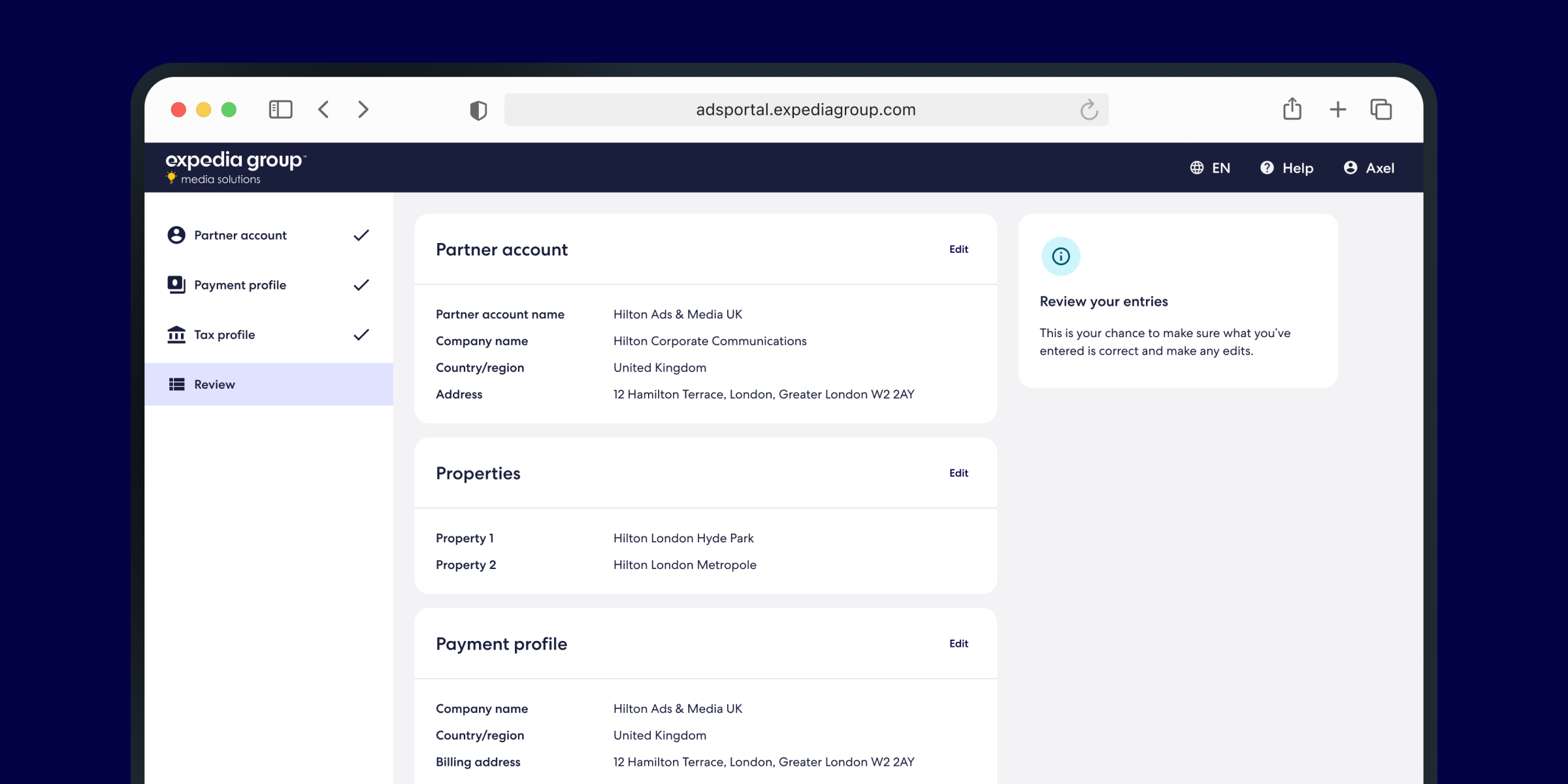
Expedia’s legacy ad portal relied heavily on manual support and lacked scalability. I helped design the Consolidated Ads Portal—a self-service platform that simplifies onboarding, streamlines campaign creation, and sets the stage for a unified advertising experience across Expedia’s product portfolio.
I partnered with the Media Solutions XD team, working alongside four product designers, a content designer, a researcher, and three product managers. Together, we owned the end-to-end experience. We also collaborated closely with the Platform Solutions team, which managed SharedUI—the interface layer for backend services used across multiple partner-facing products at Expedia Group.

I was involved early on in shaping the product direction—helping define user flows, map the experience, and explore design patterns that could scale across use cases. As the work progressed, I took ownership of Billing & Payments, Audit History, and Onboarding.
Expedia’s legacy advertising portal was fragmented and overly reliant on manual support. Setting up ad campaigns depended heavily on BDMs and didn’t offer a scalable solution. As a result, adoption remained low—especially among independent property owners. The lack of a unified system made it difficult to streamline and scale the experience.
Understanding the opportunity
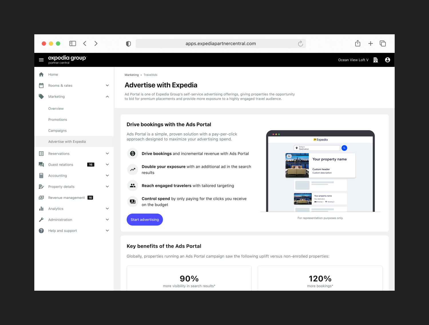
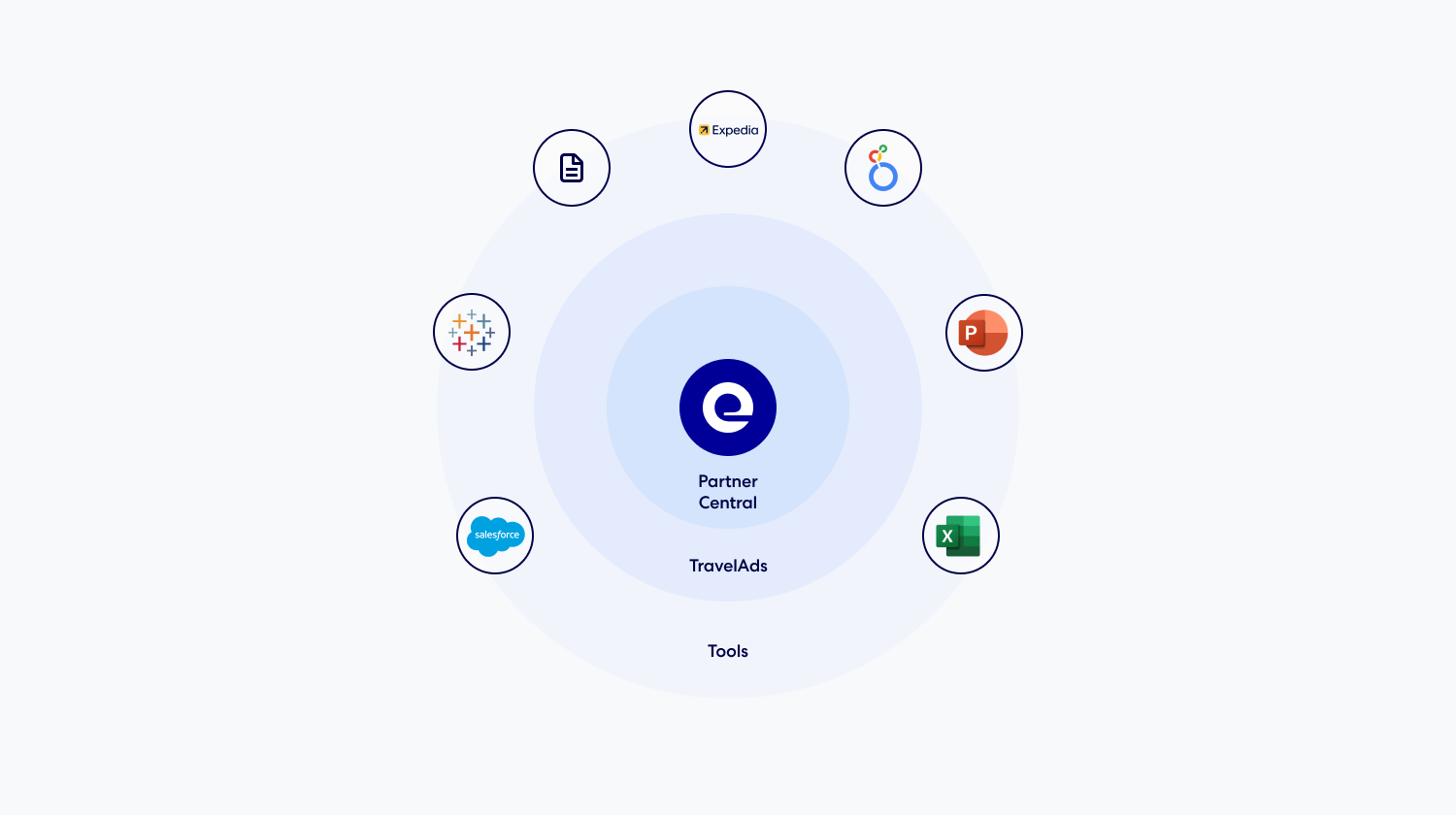
The Consolidated Ads Portal (CAP) is a B2B advertising platform designed to unify the campaign management experience across Expedia Group’s ad products. TravelAds, the legacy portal for lodging partners, was siloed from Expedia’s broader partner ecosystem, creating a fragmented experience for advertisers, who had to manage separate logins, billing systems, and onboarding flows outside of Partner Central—the core platform used by more than 850,000 properties to manage their presence on Expedia.
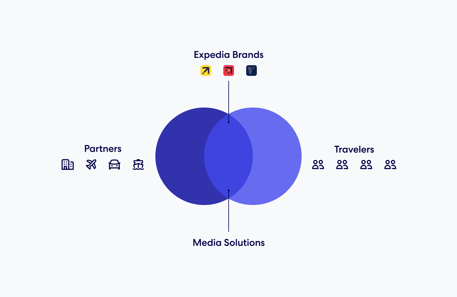
To address that fragmentation, we introduced a single entry point for advertisers through a new self-service portal. CAP was planned to launch its beta version in Q4 2024 across two US regions, with a focus on onboarding new TravelAds users—particularly independent properties, which account for 72% of Partner Central listings and 12% of TravelAds advertisers.
By directly integrating CAP into the Partner Central ecosystem and leveraging Expedia’s platform capabilities, the project aimed to drive adoption among new advertisers. A 1% increase in adoption was expected to unlock up to $32M in additional annual ad revenue.
Identifying pain points
The TravelAds experience relies heavily on the support of Business Development Managers (BDMs)—internal product experts who guide partners through every stage of the journey. BDMs educate partners on how TravelAds works, help define budgets, assist with account setup, and often write the first campaign content themselves. In practice, most first-time advertisers never launch a campaign without direct support.

A foundational research effort—including contextual inquiries and interviews with both BDMs and partners—surfaced the realities of the current TravelAds experience. By observing real interactions and workflows, the study uncovered key friction points in the partner journey and revealed just how much the process depended on hands-on human support.
The high-touch support was critical—especially for independent properties and partner teams with limited or no background in digital marketing. Concepts like cost-per-click, bidding strategies, and performance metrics were unfamiliar, and guidance from BDMs played a key role in building the confidence and trust needed for partners to get started—and to stay engaged.
BDMs were responsible for large territories and had to balance high- and low-touch relationships, often prioritizing partners with greater revenue potential. Much of their workflow was manual—sharing credentials, collecting approvals, following up over email, and logging activities in Salesforce. As a result, smaller partners were frequently underserved, and opportunities to increase adoption at scale were lost in operational inefficiencies.
Defining user needs
CAP wasn’t just about centralizing tools—it aimed to reimagine the partner experience in a way that supported confidence, autonomy, and scale. Many independent property partners didn’t know where to start, what was required to run a campaign, or how to evaluate performance. Without the hands-on guidance of BDMs, key moments like onboarding and campaign creation became major drop-off points.
“What is this, how much does it cost, what is my return?”
“I need to learn but want my campaign to go live quickly.”
“How did my campaign do, and what should I do next?”
To make self-service viable, CAP needed to do more than automate the flow. It had to replicate the most valuable parts of the BDM relationship: timely guidance, clear explanations, and reassurance that the partner was on the right track. That meant building an onboarding journey that taught by doing, surfacing campaign best practices, and providing contextual support—without overwhelming the user.
Insights gathered across markets revealed a consistent set of needs: step-by-step onboarding, budget and bidding recommendations, clarity around performance metrics, and workflows that matched their level of experience.
Shaping the product vision
The vision for CAP was to build more than a portal—it was about enabling a scalable, self-service advertising experience. Partners needed the ability to independently create and manage campaigns, control budgets, and access insights without relying on external teams or tools. TravelAds was the starting point, but the setup needed to support other ad products and lines of business as the platform evolved.

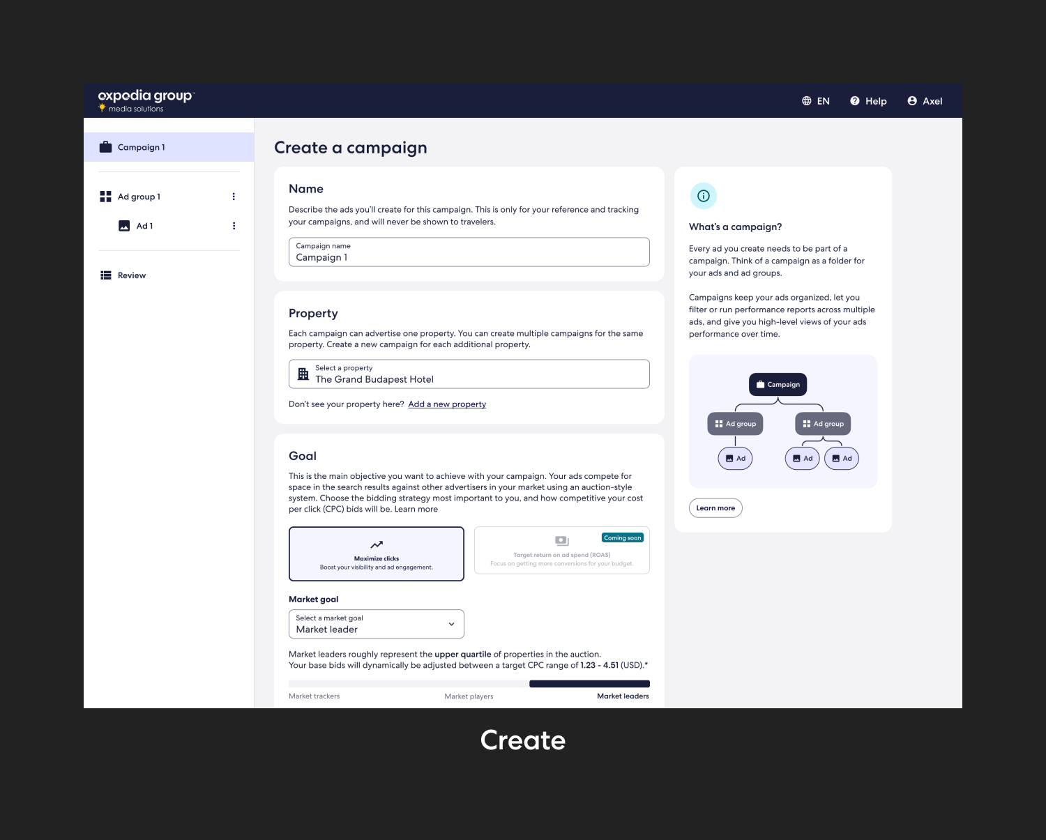
Together with the design and product team, we introduced an industry-standard campaign structure—Campaigns > Ad Groups > Ads—to support both simplicity and future scalability. While CAP Beta limited partners to one campaign per property, it was a first step toward a more modular and flexible model. This structure also aligned with broader goals across Media Solutions to streamline campaign management across all ad products.
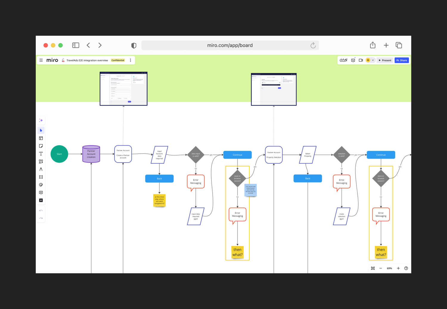
To translate this vision into a real experience, we mapped journeys for different partner profiles—from first-time advertisers to experienced TravelAds users. This helped us identify the key workstreams: onboarding, campaign creation, performance review, and campaign management. We prioritized these flows and created low- to mid-fidelity wireframes, ensuring cohesion with other partner-facing solutions.
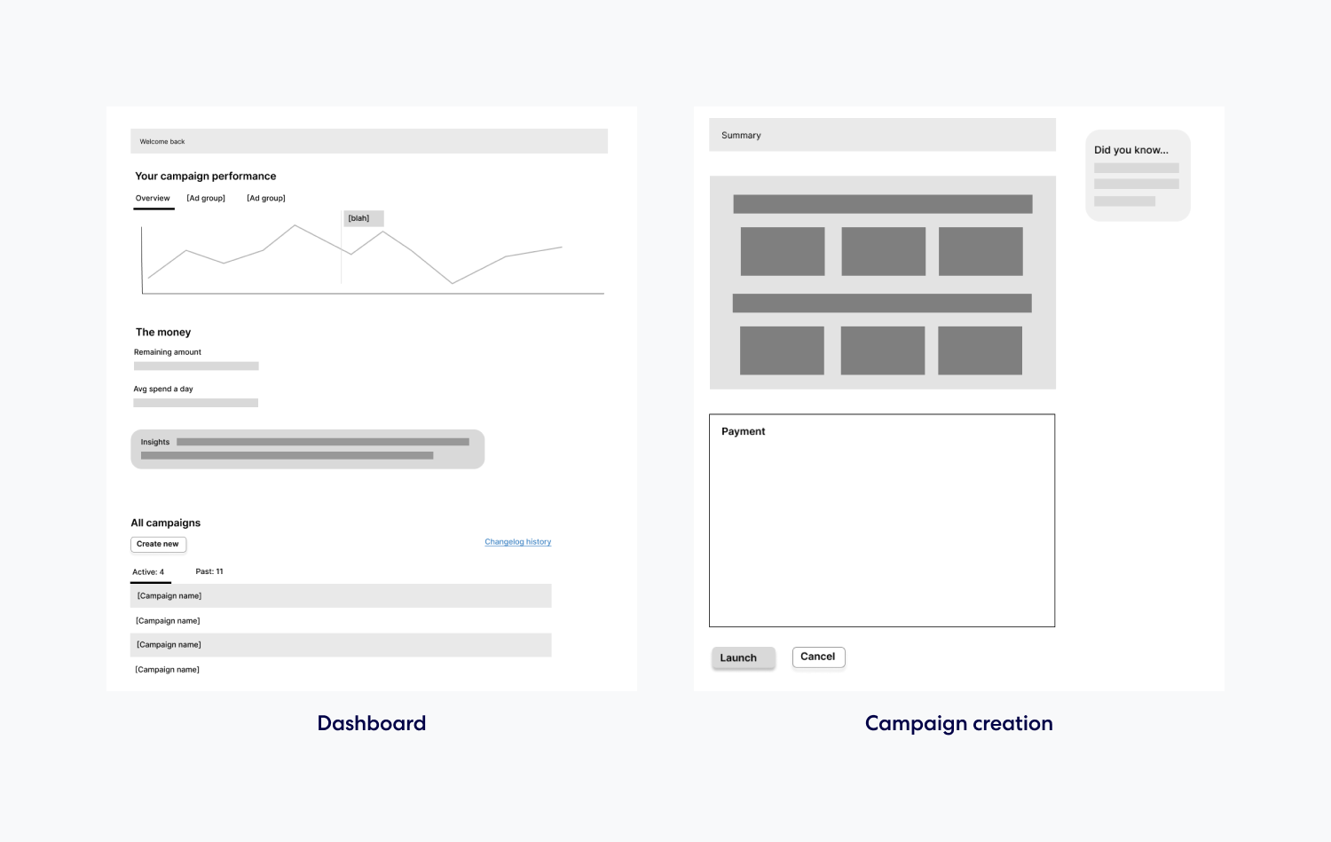
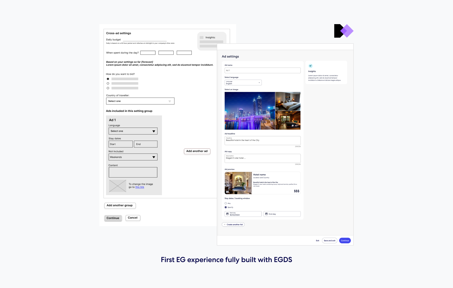
Each section of the interface was designed to guide partners with just enough structure, while allowing room for growth. The experience emphasized contextual coaching moments, simplified workflows, and a modular architecture that could scale alongside evolving product needs.

Validating our assumptions
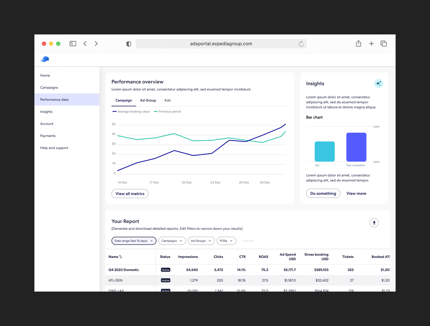
After defining the product vision, we tested our assumptions and uncovered usability issues through a concept evaluation. The sessions included partners and BDMs from six different regions, focusing on end-to-end flows—from onboarding to campaign creation and reporting. The goal was to understand how well users grasped the campaign structure, navigated key tasks, and responded to the overall self-service approach.
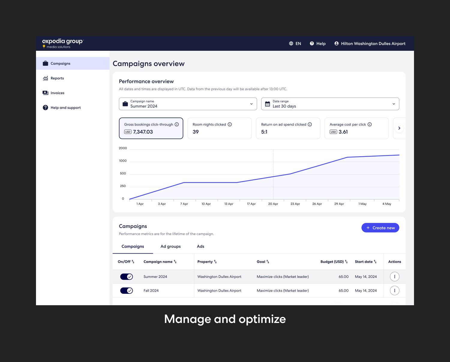
Feedback confirmed that the experience was a clear improvement over the existing tools. Participants found the linear campaign creation flow intuitive, appreciated the campaign preview and performance visuals, and responded positively to the new ad structure. However, comprehension of Ad Groups required time and guidance, especially for users without a strong marketing background. While BDMs supported the idea of more self-service, many questioned whether new partners could complete campaign setup without assistance.
Testing also highlighted key areas to improve. Partners wanted to see clearer daily spend and budget exhaustion data, which emerged as critical for monitoring campaign performance. Reporting filters lacked discoverability, and some features—like automated bidding or campaign scheduling—needed clearer context. Overall, the research validated the direction of the design while surfacing actionable insights to refine onboarding, data presentation, and coaching throughout the experience.
Key takeaways

Participants appreciated the flexibility and control Ad Groups offered—especially for seasonal campaigns and smaller budgets—but needed time and visual aids to understand the structure.
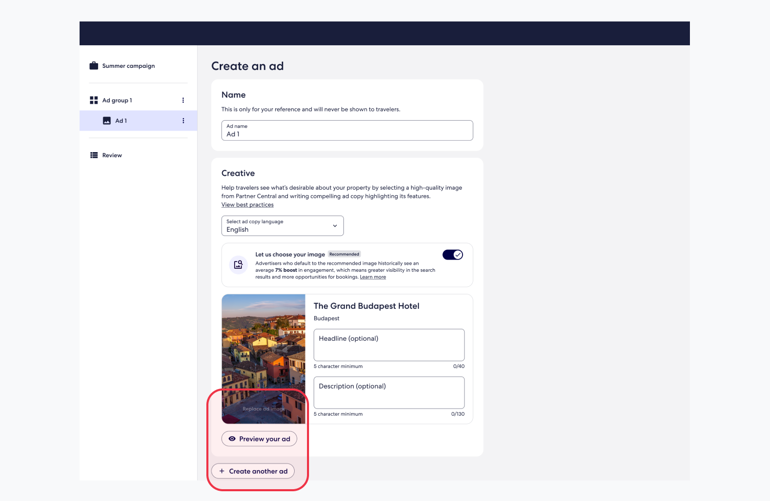
Participants appreciated the visual design and copy treatment, calling it a major upgrade from the current experience. The preview was easy to find and added value to the flow.
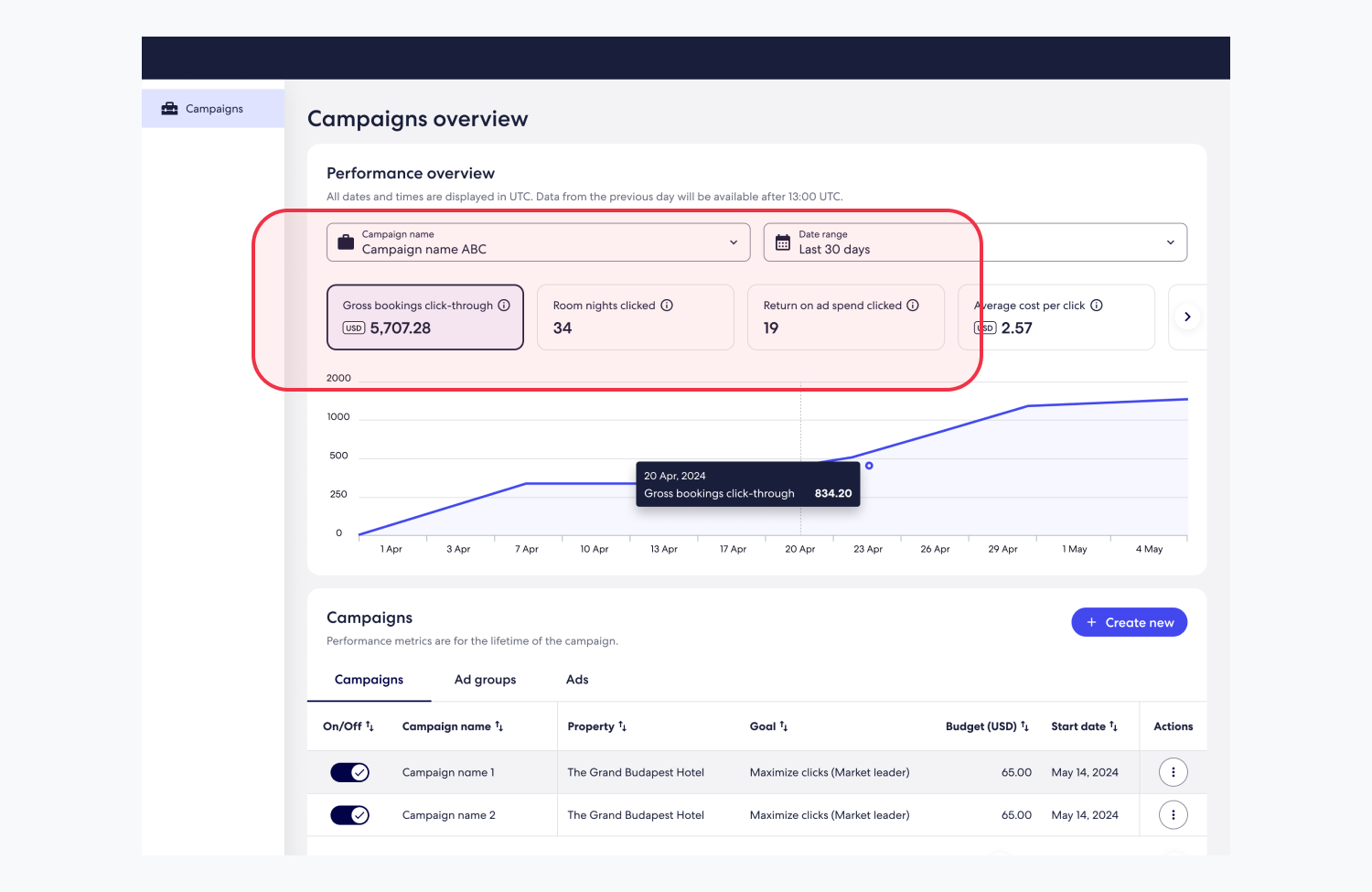
Partners found the performance carousel useful and easy to navigate, but expected clearer visibility into daily spend and budget exhaustion. Some interactive elements weren’t immediately recognized as clickable.
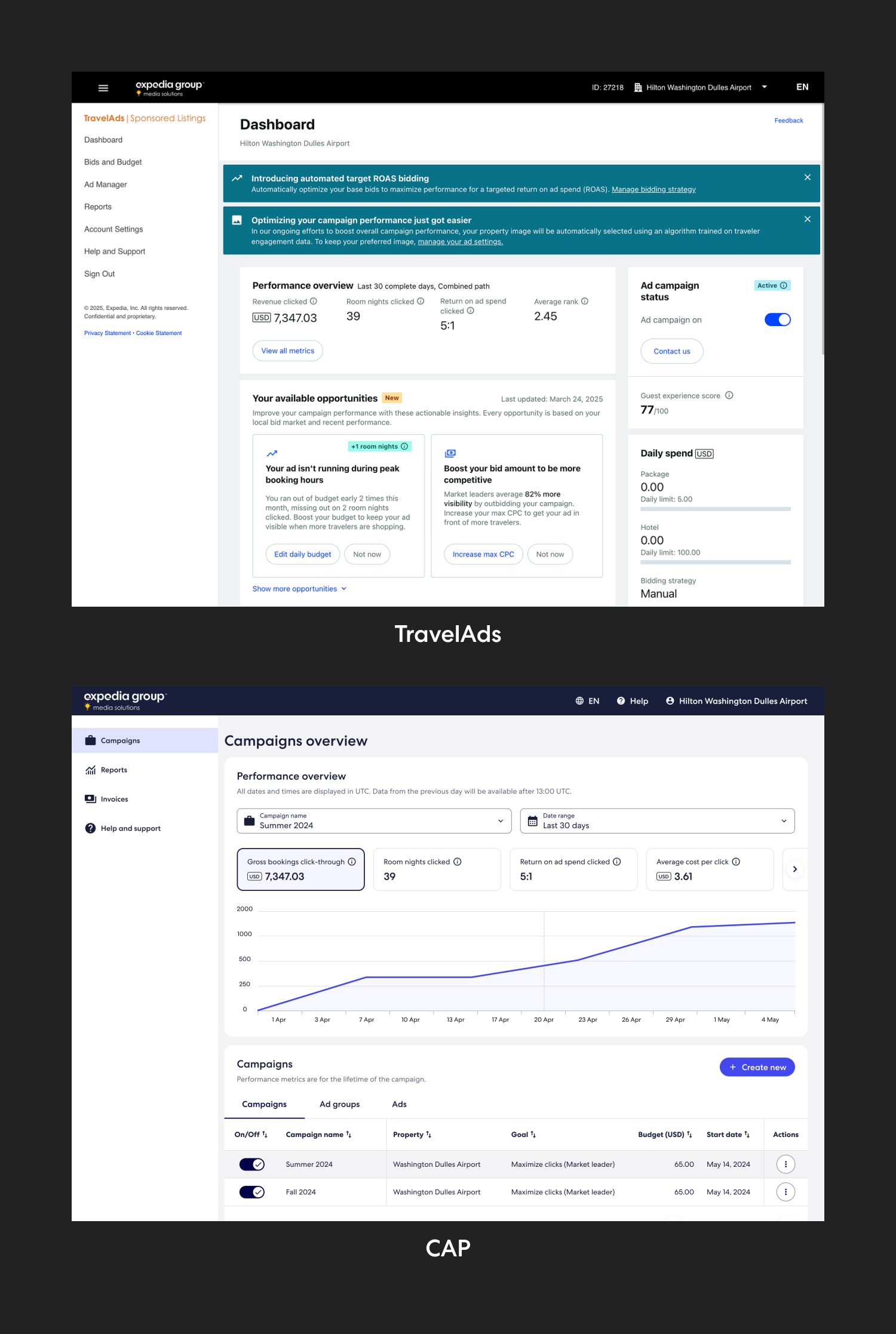
The concept evaluation confirmed that CAP was heading in the right direction. While some areas—like budget visibility and guidance around campaign structure—needed refinement, the overall response to the self-service model was positive. The feedback we gathered helped prioritize the next set of design improvements and gave the team confidence to move forward with the CAP Beta launch.
“I believe each of you knows what it looks like to be excellent at what you do.”
CAP Beta launched on November 14, 2024, to 60 C-segment partners in the US, delivering a redesigned experience for onboarding and campaign setup. The release introduced a simplified campaign structure based on marketing goals, along with early reporting capabilities for Flights Sponsored Listings. The product leveraged EG Identity, SharedUI, and unified partner profiles to align with Expedia’s platform ecosystem—and became the first experience fully built using the new EG design system.

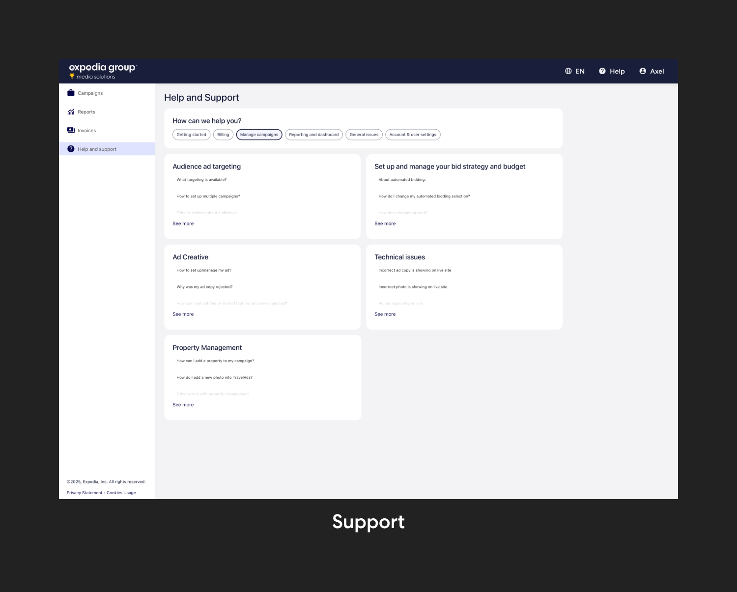
SharedUI limitations: While SharedUI enabled consistency across partner-facing products, its rigid structure limited design flexibility—especially when defining new interaction patterns or layouts
Engineering handoff gaps: Rotating teams and unclear ownership made communication challenging. Despite detailed documentation, implementation didn’t always reflect the designs, resulting in inconsistencies.
Product complexity: The number of moving parts made it difficult to move quickly. Gathering requirements often involved multiple teams and back-and-forth alignment.
Post-launch slowdowns: After the Beta release, limited engineering capacity meant few updates were made—leading to growing UX debt.
Team changes: The departure of the MeSo XD Director mid-project created gaps in leadership and stakeholder alignment at a critical stage.
Design system trade-offs: SharedUI brought consistency, but also limitations. It reinforced the importance of prioritizing usability over aesthetics.
Collaboration doesn’t stop at documentation: Clear specs aren’t enough. Sustained communication with engineering is key to maintaining design quality across handoffs and implementation.
Complex platforms require patience and adaptability: With many moving parts, alignment takes time. I learned to stay focused on incremental wins while keeping sight of the broader product vision.
Leadership gaps can become growth moments: The departure of the XD Director challenged the team’s alignment, but gave me the opportunity to step up and contribute more strategically.
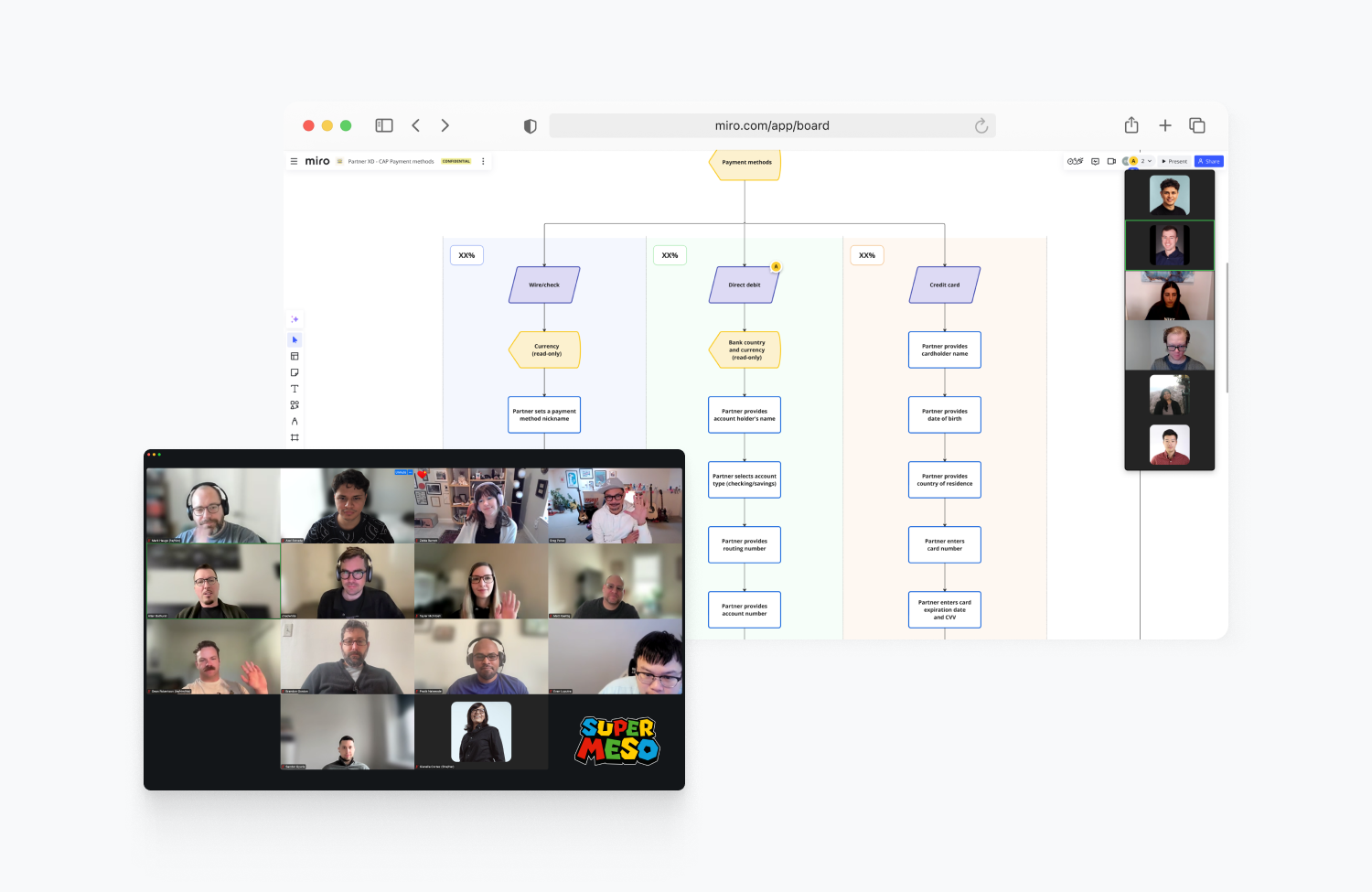
With CAP Beta live, the focus is now on refining the experience and preparing for GA. By Q4 2025, all TravelAds accounts will migrate to CAP—bringing us one step closer to supporting Expedia’s full advertising product catalog. Efforts are centered on improving content clarity, tightening interaction patterns, and addressing usability gaps surfaced through Quantum Metric data.